click images to enlarge
GFX and Title Design for a horror movie trailer. Made while completing the School of Motion Design Bootcamp certificate.
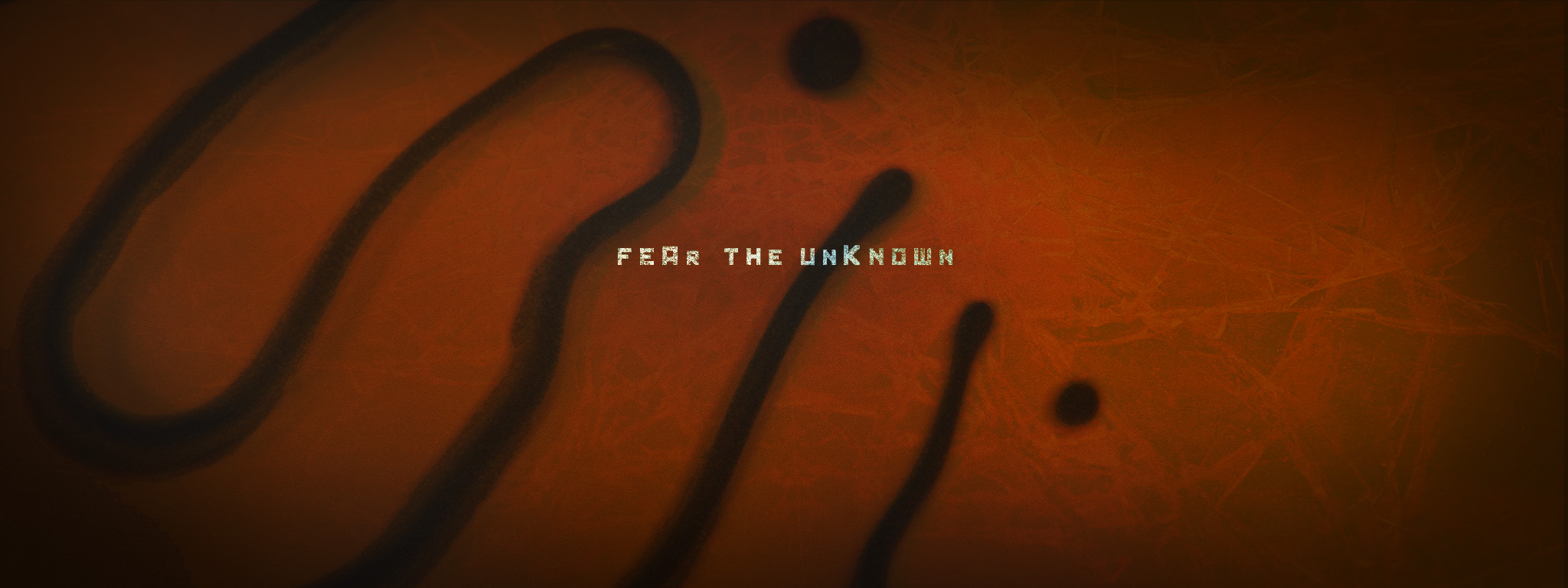
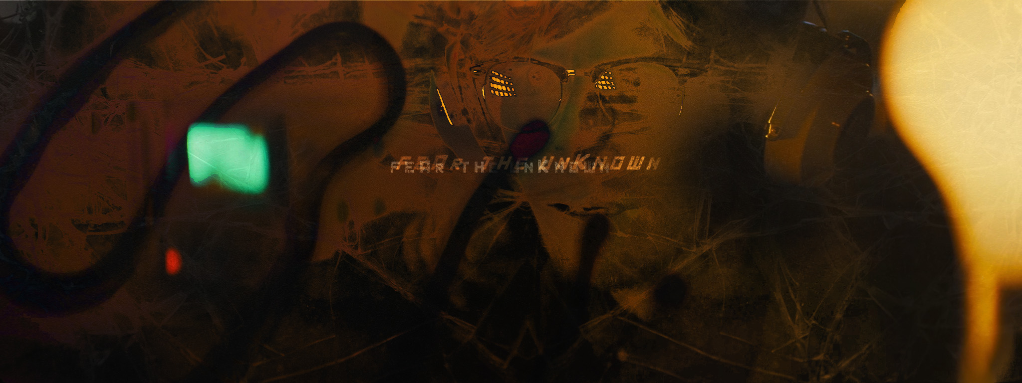
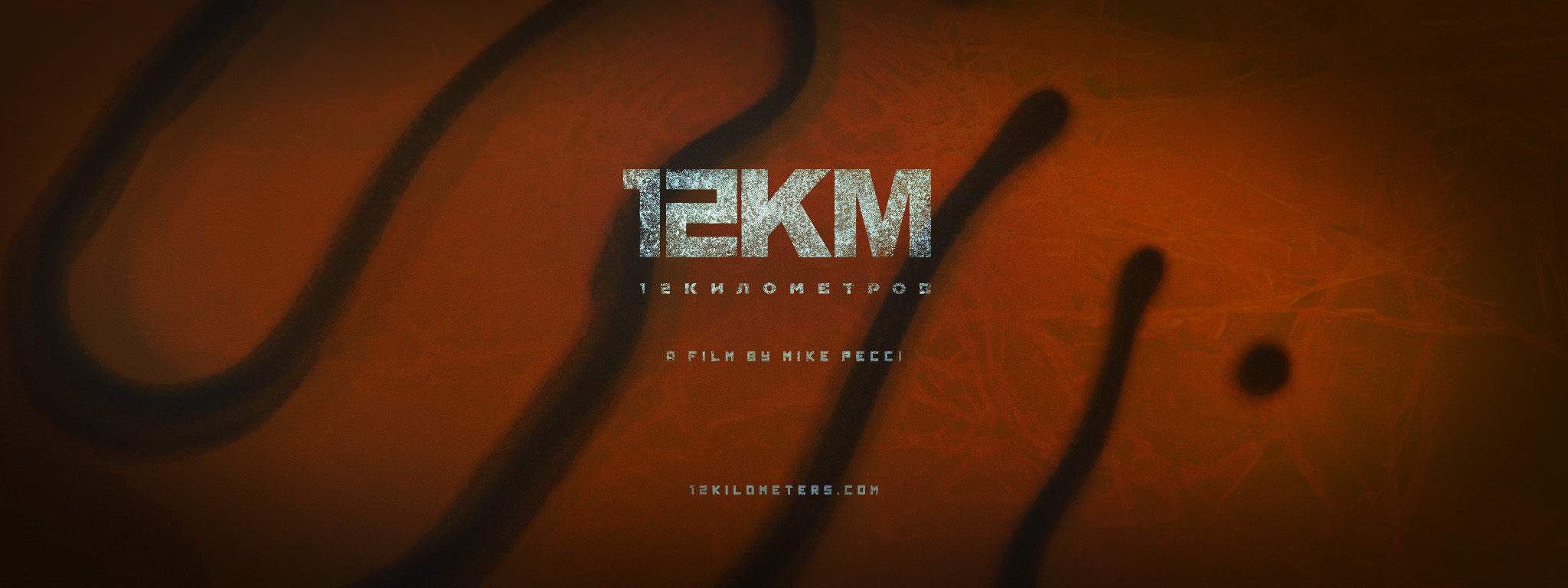
The ask for this project was to design a trailer for an indie horror film premiering at an upcoming festival. We were tasked with creating the opening title card, end card, overall GFX look for the trailer, and some examples of how graphics would transition in and out of live footage.
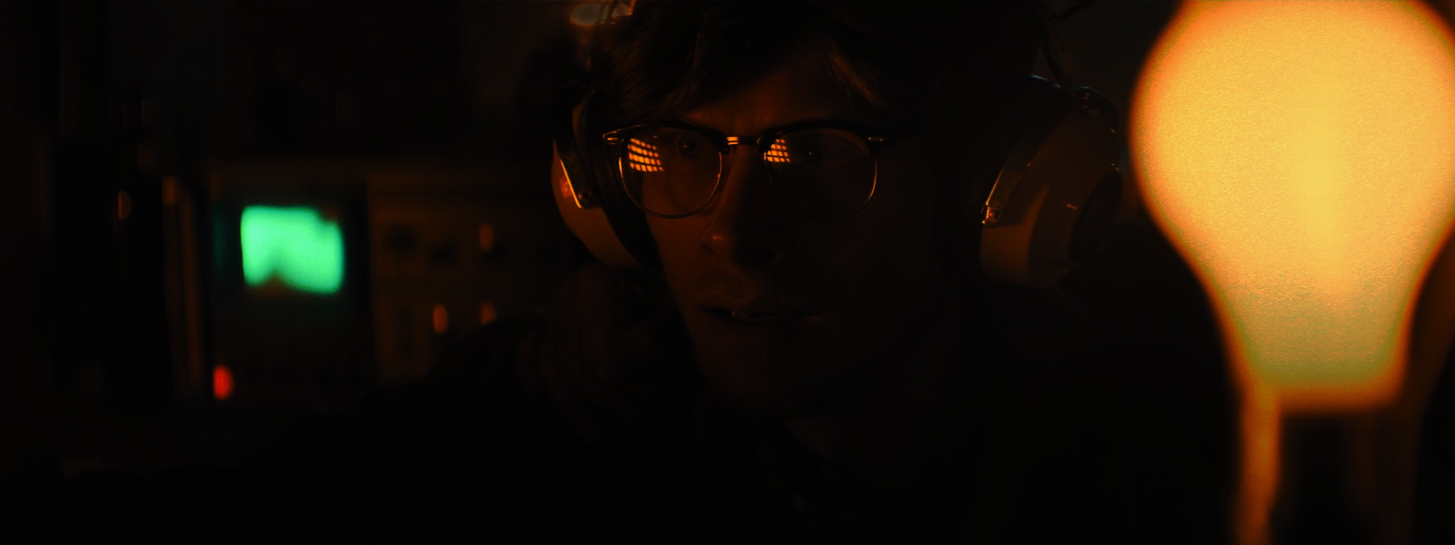
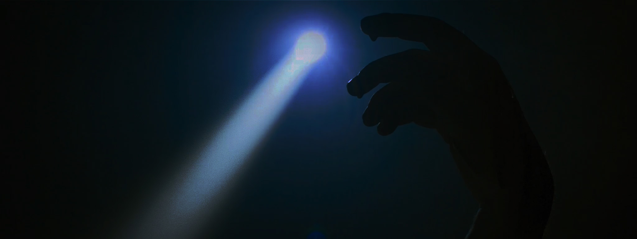
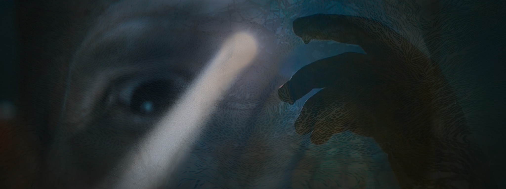
In their rough cut, a short scene featuring an amoeba-like ooze immediately caught my eye—unsettling, ambiguous, and weirdly alive. I used it as a core visual reference, building the design language around that sense of creeping unease. I pulled additional shots from the film that leaned into the psychological unraveling of the characters and let that tone drive the visual approach.
Rather than showing the ooze outright, I wanted to preserve the tension around what it is and how it behaves. I leaned heavily into texture—organic but unrecognizable, shifting and unstable. Nothing symmetrical, nothing polished. The threat stays abstract, and that’s what keeps it unnerving.
Aesthetically, I made sure to support the what the director had already established — dark, deteriorated, and rooted in a retro 80s horror sensibility. I focused on maintaining a consistent tone that felt analog and tactile, reinforcing the psychological unease without over-explaining the threat. The goal was to balance restraint with tension, letting the visuals work quietly beneath the surface to build atmosphere.
Additional Client Direction:
- The film is a throwback to 1980’s horror movies like The Thing. It’s dark, creepy, and has an ominous tone throughout. The trailer GFX should reflect that.
- 12KM was shot 2K with anamorphic lenses. Graphics should be designed for a 2048x768 format.
- We love the color-grade on the film, so don’t mess with colors (unless for a transition.)
Check out some of my visual inspiration on my Pinterest board for this project.